From institutional structure to student reality
2023
Reimagining Concordia's student app around what a student needs now, next, and nearby
Client
Concordia University · UCS Web Team
My Role
Product · Interaction · Design Engineering
Team
Product & interaction design, React Native build
Timeline
Ongoing exploration · 2025–26
Concordia already ships a student app that tens of thousands open every semester. It's a capable app — but a directory, not a companion. It tells you where things live, not how to move through your day.
I explored what it would take to turn it into a companion: an app organized around a student's moments — a next class, a room to find, a deadline, a balance, an event nearby — rather than the institution's systems.
The result is a working React Native prototype and the product thinking behind it: information architecture, a contextual home, a campus place model, and a coherent design system carried from Claude Design through Figma into native code.
It's an ongoing exploration, not a launched product: some of it is explored, some designed, some implemented, and some still unresolved.
Outcomes at a glance This isn't a launched product, so these aren't outcomes — they're the real signals that framed the work: eight years of usage on the existing app, and the last structured student survey.
The class schedule is the single most-used surface, every year since 2017 — so time becomes a first-class object.
DemandSteady for eight years across five app generations — genuine, sustained demand, not a hypothesis.
ScaleThe 2018 student feedback survey. Its top requests — integrated Moodle, campus events, indoor maps — are still the openings.
EvidenceA real Expo / React Native build across five tabs, live where the data exists and honest where it doesn't.
BuiltToday vs. the direction
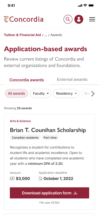
Before. The app that ships today — a directory of links to each university system.
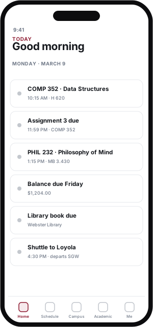
After. The direction I explored — a companion organized around a student's day.
Five tabs, five questions — the app at a glance.
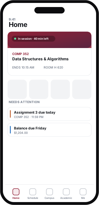
Before the deep dives, here’s what the companion looks like. Each tab owns one primary object and one question. Home reads across them; the rest go deep on time, place, semester, and the student as a person.
Screens below are from the working prototype — some live on real data, some on mocks. The point of this pass is orientation, not proof.
Home
What matters right now? A live session card, needs-attention, and campus-today — ranked by relevance, not equal-weight modules.
Home
What matters right now? A live session card, needs-attention, and campus-today — ranked by relevance, not equal-weight modules.
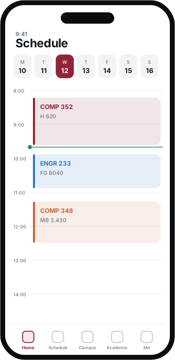
Schedule
Where and when do I need to be? Time is the primary object — the same timetable Home’s session card reads from.
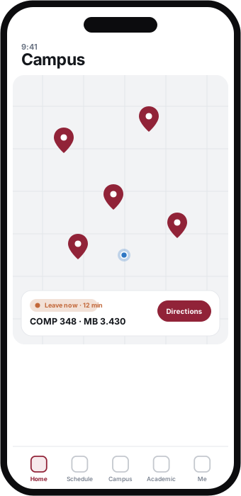
Campus
What’s happening around me? A place-intelligence map with a ranked context card — not a directory of map links.
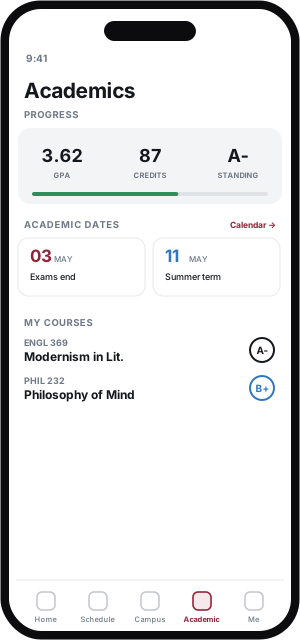
Academic
How is my semester going? Courses as the primary object — progress, grades, and deadlines without a second sitemap.
Students don't experience a university as systems.
The institution is organized around systems. Students live it as moments — and the gap between the two is where the friction is.
SIS, Moodle, the library, facilities, dining — six or more systems that don't talk to each other.
A next class, a room to find, a deadline, a balance, and something happening on campus tonight.
The current app faithfully mirrors the systems, so students stitch the answers together themselves. It answers **“where is the link?”** far better than **“what do I need right now?”** The 2018 survey (n=1,007) had already named the gaps — integrated Moodle, campus events, schedule improvements, push reminders, and in-building maps. Eight years of the current app surface three systemic gaps:
It's a directory, not a companion.
It tells you where things are, not what to do or when to do it.
There's no proactive layer.
It never says “your class starts in 42 minutes” or “your library book is due tomorrow.”
Navigation stops at the building door.
No indoor wayfinding, no study-space availability, no room-finding once you're inside.
What students asked Concordia to add
2018 student feedback survey · n = 1,007 · number of requests. Aggregate counts, not individual responses.
The same university, experienced from two incompatible directions.
What a student is actually asking
What the university hands them
SIS / MyConcordia
Schedule, grades, fees
Moodle
Course content
Library catalogue
Books, hours, rooms
Maps & facilities
Buildings, shuttle
Events & dining portals
Separate web properties
Six or more systems, several logins, zero shared context.
Like many of you, I've spent way too much time fighting with the SIS and trying to figure out which prerequisites unlock what.
Concordia student
r/Concordia
How might we
How might we turn fragmented university systems into a proactive daily companion that surfaces what students need, when they need it?
From eight years of signals to a working prototype
The synthesis draws on real inputs: the 1,007-response survey, eight years of analytics, and the legacy Twixl inventory, distilled into one framing question.
The sequence was unconventional: the formal UX artifacts were reverse-engineered from the working prototype, and validation (usability, card-sort, diary studies) is planned rather than complete.
Insight
A directory answers “Where do I find it?” A companion answers “What matters now?”
What belongs on Today?
The home tab was the hardest to name. Early versions tried to show everything about the day at once; the real question was narrower — what does a student need the moment they open the app? Generating layouts was cheap, so I pushed on that question instead of polishing one screen.
The key decision
Today owns what needs my attention now — not a full inventory of everything, and not an endless feed.
A single briefing list — classes, deadlines, balances, holds — with every item weighted the same.
Comprehensive, but nothing tells you where to look first.
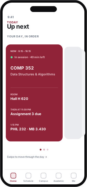
Reframed the day as a chronological deck: what's happening now, then what's next.
A better sense of time — but it buries anything that isn't time-bound.
Settled on a live “now” card above a short “needs attention” list — the day, filtered to decisions.
What's happening now, then only the few things that need a response.
What is Academics actually for?
This wasn't a process to document — it was a product question I kept re-answering: what does this tab actually own? Generating alternatives was cheap, so I tested competing models instead of polishing one. Three shaped the answer.
The key decision
Today owns what needs my attention now. Academics owns how I’m progressing and where my academic information lives.
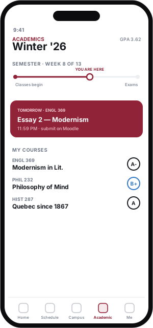
Combined semester position, upcoming obligations and course performance in one dense view.
A “you are here” term timeline; GPA demoted to a secondary stat.
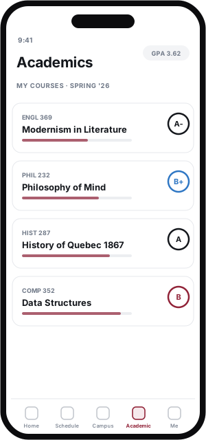
Reduced temporal information and made courses the primary object.
Separated persistent progress from time-sensitive events, while keeping important academic dates.
Progress and academic dates become two distinct blocks.
How should Campus work?
Campus started life as a menu — a set of links out to the university's systems. The real question was what a student is doing when they open this tab: not browsing services, but trying to get somewhere, on time.
The key decision
Campus answers “where's what I need, and when do I leave” — a wayfinding canvas, not a directory of links.
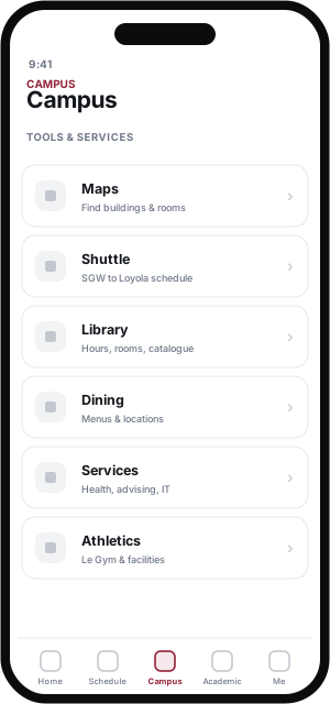
The first model was a list of links — Maps, Shuttle, Library, Services — one row per system.
It mirrors the org chart, not the moment you're late and standing on a corner.
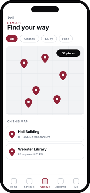
Collapsed the links into a single map; filter chips drive both the pins and the list of what's shown.
Everything on one surface — but still a tool you operate, not an answer.
Made the map the canvas and added a ranked context card: your next class and when to leave.
The card answers “what matters here, now”; the map answers “where.”
Some questions only the build can answer.
Whether the card's expand reads as a morph or a cut, whether the release is one gesture or two, where a white flash hides — Figma can't answer these. They were decided in React Native: springs over timing curves, quadratic easing on close, blur intensity quantized so the frost stays smooth.
Increasingly, I use working software — not a static comp — as the place a design actually gets resolved.
Session card → detail morph (screen recording)
Schedule week paging + live now-line (recording)
AI made iteration fast. The decisions stayed mine.
Generative tools dramatically lowered the cost of exploring alternatives, so I could test competing product models instead of prematurely polishing a single direction. My role shifted toward framing the problem, evaluating the output, spotting contradictions, and carrying the good ideas forward.
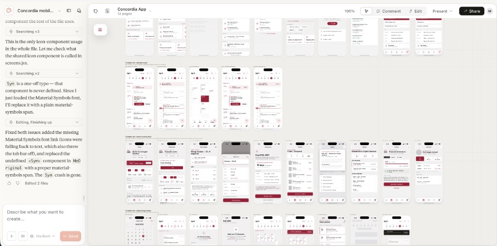
The Claude Design canvas — dozens of directions and annotations across Today, Academics, Campus, and the design system.
AI increased the breadth and speed of exploration. I supplied the product judgment that set the direction.
2023
2023
2025
Want to see more? Check out my other work or get in touch.