
From institutional structure to student reality
2023
Reframing a high-traffic calculator students read as a final bill
Client
Concordia University, Business Process Office
My Role
Interaction designer & Accessibility Advisor
Team
Interaction designer & Accessibility Advisor
Junior Front End Developer
Manager, Web Evolution Team
UX Strategist
Timeline
Feb – Jun 2023
The Tuition fee calculator was one of the university’s most-used financial tools — pulling roughly 5,000 unique views a week on its own.
The problems were mostly design and UX debt. The original estimator — built years earlier in Java and left without an owner in any financial office — looked dated, buried complexity, produced misleading output, and failed on mobile and accessibility.
I helped expand a front-end proof of concept into a full UX effort: rename and reframe the product as an estimator, redesign the flow through moderated testing, align eight stakeholder offices on fee logic, and ship a WCAG 2.0 AA responsive build wired to AEM content fragments — so Student Accounts could maintain fee data themselves instead of relying on a developer.
Outcomes at a glance Validated through heuristic review, five moderated usability sessions, stakeholder interviews, and pre-launch accessibility QA.
Copy and IA now set expectations for approximation — based on common scenarios, not every student edge case.
Product framingUndergrad, graduate, CEGEP, and doctoral participants surfaced conflicting expectations — each iteration narrowed what the tool could honestly promise.
ResearchFee logic moved into AEM content fragments so Student Accounts can update rates without a developer — replacing an unmaintained Java tool with a responsive, WCAG 2.0 AA build.
OwnershipA calculator that couldn't do math students believed it did.
Prospective students needed a ballpark cost. The legacy tool gave them something that looked like an invoice.
A precise, bill-style total students read as their final cost — but with no owner keeping fees current, the figures rarely matched what they actually owed.
The amount that actually appeared on the student's account — the figure the calculator failed to reflect.
The gap drove support volume. Prior research from the tuition & financial aid subsite work had already flagged estimator confusion; this project had to fix the product, not just the stylesheet. Three constraints shaped every design decision:
Misleading completeness.
Line-item breakdowns implied authority, but certificate, diploma, and residency rules lived outside the logic.
One developer, fixed timeline.
Program-level selection was deferred — accuracy had to come from framing and notices, not infinite branching.
Staff relied on the same UI.
Recruitment and the International Students Office used the public tool in live conversations — internal accuracy expectations matched student ones.
Challenge
How do you estimate tuition without over-promising precision?
The legacy tool showed an exact total it couldn't keep accurate or defend — stale data and endless discrepancy questions. The fix: an approximate figure that's honest about being an estimate, backed by data staff can actually maintain.
Same accordion skeleton, different promise
The engineering proof-of-concept structure survived. What changed was the contract: estimator language, layered results, and honest scope limits before students treat a screenshot as a bill.
Before. Legacy tuition fee calculator
After. Shipped tuition fee estimator — selection flow and results hierarchy
From front-end POC to UX-led iterations
Engineering started with a Bootstrap 5 vertical accordion — a sensible structure proof. I joined to broaden scope: competitive reviews of peer universities, wireframes in Figma, then prototype testing before interactions hardened in code.
We reused interview insights from the broader financial ecosystem project rather than restarting discovery from zero.
Eight offices shaped the estimator, experienced as one tool
Interviews across eight offices surfaced conflicting labels and calculation assumptions — compulsory vs. university fees, health insurance by term, certificate eligibility:
Working sessions produced a shared logic document and an explicit list of what the estimator would not model.
Usability testing
findings & iterations
Participants ranged from co-op applicants researching costs before applying to admitted students sanity-checking a letter. They didn’t agree on everything — doctoral students rejected a single degree total while master’s applicants found it useful; some wanted accordions to auto-open, others to advance deliberately. The shipped design reflects scenario-based rules, not a single preference.
Research finding
Quebec resident and permanent resident were easily confused; CEGEP transfers struggled with degree type and course load.
Design response
Plain-language residency options, faculty as its own step, and tooltips on full-time vs part-time. Completed steps collapse with checkmarks and a visible summary of what was selected.
Research finding
Students wanted cost per credit, annual totals, and term breakdowns at different moments — and a doctoral participant said quoting one degree total “doesn’t make sense.”
Design response
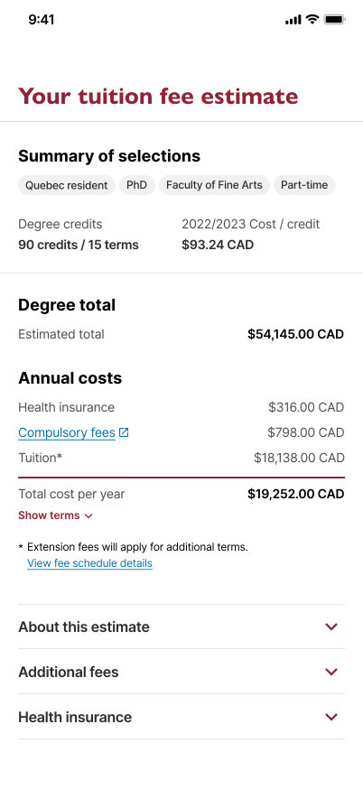
Results separate cost/credit, estimated program total, and total cost per year. “Show terms” reveals term-level detail without hiding the annual figure.
Research finding
Expandable totals and important notices weren’t discoverable — participants saw notices but didn’t feel compelled to read them.
Design response
Estimate context, additional fees, and health insurance moved into dedicated accordions. Footnotes and links carry policy detail instead of burying it in the primary total.
Research finding
Tap targets sent people to the wrong section; participants split on whether the next accordion should open automatically.
Design response
Deliberate, user-initiated progression — students open the next pane when ready, with validation that scrolls to the first incomplete step instead of silent failure.
Research finding
Co-op terms, program finder, external funding, and program-level detail sat outside what the estimator could model honestly.
Design response
Scope called out in copy; links to program pages, fee schedules, cost-per-credit paths, and the broader financial hub — rather than incomplete logic inside the tool.
The shipped tool teaches limits before it shows totals
Responsive, accessible, and honest about approximation — paired with the unified tuition & financial aid hub so prospective students can move from estimate to funding without switching mental models.
A long form, one decision at a time.
Radio buttons enforce one choice per step; accordions handle residency, degree, faculty, and course load without surfacing every fee table upfront.
Selection flow
Course load & tooltips
Layered totals, linked context.
Results show cost/credit, program total, and annual summary in distinct layers — with compulsory fees, health insurance, and tuition broken out. What the tool can’t model links outward to program pages, fee schedules, and the financial hub.
Estimate summary
Breakdown & notices
Built to WCAG 2.0 AA, maintained in AEM.
Keyboard order follows visual hierarchy; errors announce to screen readers; tooltips and accordion state are exposed to assistive tech. Fee values pull from AEM content fragments so BPO can update rates without a front-end deploy.
Responsive layouts
Content fragment model
Qualitative signals, no product analytics
QA verified calculation accuracy against published rates; accessibility passed pre-launch review; BPO reported faster fee updates via fragments. If I ran it again: stakeholder discovery before development starts, not after.
2023
2025
2024
Want to see more? Check out my other work or get in touch.