Tuition fee estimator
2023
Designing clarity across tuition, fees, and financial aid
Client
Concordia University, Financial Services
My Role
Interaction Designer & Digital Content Advisor
Team
Interaction Designer & Digital Content Advisor
UX Strategist
Timeline
6 months
Finding critical information on tuition, fees and financial aid shouldn't add to the stress of navigating student life.
Tuition, fees, deadlines, and financial aid information are some of the most consequential details students deal with — and often at the most stressful moments of their academic journey.
Financial information at Concordia was accurate, comprehensive, and well-maintained — but it was structured around institutional ownership, not student decision-making.
I led the redesign of the student financial experience, reworking the information structure to better reflect how students search for and make sense of costs, deadlines, and financial support.
The work reduced friction at key decision points and supported the introduction of new tools, including a tuition estimator and awards search.
Outcomes at a glance Measured across two research rounds — each usability session was preceded by student interviews that shaped the task scenarios.
+18 percentage points on the same core scenarios — largest gains on fee deadlines (11% → 86%) and tax information (33% → 86%).
ValidationTuition, fees, and financial aid consolidated into a single subsite — replacing a two-subsite model that split student attention.
Information architectureUnified navigation patterns across the financial journey, built on the validated structure.
ShippedPaying for university shouldn't feel like solving a puzzle.
Tuition, fees, deadlines, and financial support were split across two subsites:
Billing and payment.
Funding and eligibility.
From an institutional perspective, this separation made sense. From a student perspective, it created confusion at exactly the moments they were trying to understand cost, timing, and options together. A content audit of the financial subsites revealed three systemic issues:
Content was fragmented across multiple subsites.
Tuition, fees, and aid lived in separate places, so students had to stitch answers together across sites.
Structure didn't match how students search for information.
Structure mirrored internal ownership, not how people search when they need clarity under pressure.
There was no single source of truth.
Overlapping or conflicting details made it hard to know what to trust at critical moments.
Quotes from round-one pre-test interviews (first names are pseudonyms)
“Trying to find financial information at Concordia feels like searching through a maze. I never know where anything actually lives.”

Cedric
Economics, 2023
“I never know where to look for deadlines. Why is tuition in one place and financial aid somewhere else?”

Maya
Computer Science, 2024
“I had to open five different pages just to understand my bill. The information feels scattered — I'm always missing something.”

Jordan
Fine Arts, 2023
“It would help if everything about costs was in one place. The current setup adds unnecessary stress.”

Sam
Engineering, 2025
“I bookmark three different portals and still end up emailing someone because I’m not sure the page I’m reading applies to my program.”

James
Political Science, 2024
“When I compare fees and awards I literally keep two tabs open and reconcile them by hand—it shouldn’t take that kind of detective work.”

Josh
Biology, 2023
“The moment I click into a dense policy PDF I give up—I need answers in plain language in one coherent flow.”

Lily
Journalism, 2025
“Trying to find financial information at Concordia feels like searching through a maze. I never know where anything actually lives.”
Cedric
Economics, 2023
“I never know where to look for deadlines. Why is tuition in one place and financial aid somewhere else?”
Maya
Computer Science, 2024
“I had to open five different pages just to understand my bill. The information feels scattered — I'm always missing something.”
Jordan
Fine Arts, 2023
“It would help if everything about costs was in one place. The current setup adds unnecessary stress.”
Sam
Engineering, 2025
“I bookmark three different portals and still end up emailing someone because I’m not sure the page I’m reading applies to my program.”
James
Political Science, 2024
“When I compare fees and awards I literally keep two tabs open and reconcile them by hand—it shouldn’t take that kind of detective work.”
Josh
Biology, 2023
“The moment I click into a dense policy PDF I give up—I need answers in plain language in one coherent flow.”
Lily
Journalism, 2025
“Trying to find financial information at Concordia feels like searching through a maze. I never know where anything actually lives.”
Cedric
Economics, 2023
“I never know where to look for deadlines. Why is tuition in one place and financial aid somewhere else?”
Maya
Computer Science, 2024
“I had to open five different pages just to understand my bill. The information feels scattered — I'm always missing something.”
Jordan
Fine Arts, 2023
“It would help if everything about costs was in one place. The current setup adds unnecessary stress.”
Sam
Engineering, 2025
“I bookmark three different portals and still end up emailing someone because I’m not sure the page I’m reading applies to my program.”
James
Political Science, 2024
“When I compare fees and awards I literally keep two tabs open and reconcile them by hand—it shouldn’t take that kind of detective work.”
Josh
Biology, 2023
“The moment I click into a dense policy PDF I give up—I need answers in plain language in one coherent flow.”
Lily
Journalism, 2025
Trying to find financial information at Concordia feels like searching through a maze. I never know where anything actually lives.

Cedric
Economics, 2023
Challenge
How do you guide change from institution-first structures to a model that reflects how students think about costs and funding?
Student Accounts and the Financial Aid & Awards Office each owned a subsite and wanted to keep that split. Guiding the change meant moving from office-owned structure to a student-intent hub under that ownership pressure — proving the dual model failed orientation, while leaving units in control of their content behind a shared IA.
A one-stop shop for tuition & financial aid
We framed the work around a single question:
What structure best supports financial decision-making, under stress, for first-time and returning students alike?
This led to three deliberate decisions:
Unify tuition, fees, funding, and aid in one coherent hub.
Simplify how scholarships, bursaries, and awards are found and explained.
Surface email and phone support when students need a human answer.
Sorting through the complexities of financial information on our site
Financial information was spread across separate subsites and policy pages — accurate in isolation, but impossible to traverse when a student needed a full answer. I worked in two rounds: propose a structure, test it with students, then cut what didn't hold. The steps below show how that moved from audit to prototype.
Our product vision called for a single subsite organized around student intent — but Student Accounts and the Financial Aid & Awards Office were insistent on maintaining two separate sites. We were confident that split would fail students in practice, so we built Design I anyway: a Student Financial Resources landing page with two nav links into separate subsites, prototyped to surface the friction and prove the case for consolidation.
User interviews & usability testing
Design I presented students with a Student Financial Resources landing page. Two main nav items — Tuition & fees and Financial Aid & Awards — linked to separate subsites, and the landing page also surfaced first-level pages from each. We interviewed each participant before their moderated session; those conversations shaped the task scenarios below.
During testing, participants often reached a subsite by clicking a top-level nav item or a child link on the landing page. Either route replaced the hub navigation with that subsite's own IA — and most never noticed the switch. Success was scored per task as Success, Use difficulties, Close call, or Task failure — without moderator intervention.
Usability testing results
Design I was the dual-subsite model stakeholders wanted: a Student Financial Resources landing page with two nav links — Tuition & fees and Financial Aid & Awards — into separate subsites. We interviewed each participant before their moderated session; those conversations shaped the tasks.
Overall task success was around 55%. Orientation — not page-level clarity — drove the misses: fee deadlines succeeded for about 11% of participants, tax information for about 33%. Students understood individual pages, but not whether they had covered everything on the other side of the split.
Task scenarios reflected what students said they look for in pre-test interviews — validated with each participant before the moderated session. First names in quotes are pseudonyms.
Design I success rating
The 1st iteration wasn't quite there yet
Design I gave stakeholders the dual subsite model they had asked for — not the single hub we had argued for. Students saw a Student Financial Resources landing page with two main nav items — Tuition & fees and Financial Aid & Awards — each linking to a separate subsite. The landing page also surfaced first-level pages from both sides, so there were two ways into each property.
In round-one testing, participants often clicked either a nav item or a child link on the landing page. Both routes dropped them into a subsite where the navigation changed entirely to reflect that unit's IA. Most didn't register the swap — classic change blindness.
They understood individual pages, but not whether they had covered everything on the other side of the split. The problem wasn't clarity at the page level — it was orientation across subsites.
Before. Image showing our expected user reading path.
After. The reading path revealed in user testing.
Key insight
Participants didn't notice when the navigation changed.
Rethinking the two-subsite model
Clicking a nav item or a child link on the landing page swapped the entire navigation — but participants didn't notice they had left the hub, and often missed information that lived on the other subsite.
We rethought the model — moving away from parallel subsites toward a more unified experience aligned with student intent and key decision moments.
The three high level changes had to be made:
Student Financial Resources hub with Tuition & fees and Financial Aid & Awards nav links into separate subsites
Landing page surfaced first-level pages from both — either entry path replaced the hub navigation
Participants didn't notice the navigation swap (change blindness)
Usability testing results v2
We addressed round-one findings by consolidating to a single subsite (Design II), then re-tested the redesigned hub in a second research round with the same cohort — again interviewing each participant before their moderated session.
On the same core scenarios plus three added tasks (Error, Cost / credit, Budgeting), overall task success rose from 55% to 73% (+18 pp). The largest gains were on fee deadlines (11% → 86% success) and tax information (33% → 86%), where orientation — not page-level clarity — had been the blocker.
Task scenarios reflected what students said they look for in pre-test interviews — validated with each participant before the moderated session. First names in quotes are pseudonyms.
Error, Cost / credit, and Budgeting were added for round two after consolidating to a single subsite.
Design 2 success rating
Error, Cost / Credit, and Budgeting were new topics added after the first set of tasks.
Task success rose from 55% to 73% after consolidating to a single financial subsite.
V1 – Dual subsite with single entry point
55%
V2 – Single subsite
73%
+18%Scores reflect moderated prototype testing, not post-launch analytics. Each bar pools task outcomes across participants. Design II includes three additional scenarios beyond the core set; the headline comparison uses aggregate success across all scored outcomes shown.
Students described less searching and more confidence after the redesign
After round-two interviews and testing on the unified hub, feedback mirrored the quantitative shift: students referenced finding information faster, trusting the structure, and following a single path from tuition through deadlines to funding.
What students said in round-two interviews (first names are pseudonyms):
“This is so much easier to navigate now. I found what I needed in under a minute.”
Cedric
Economics, 2023
“Having everything in one place makes a huge difference. I actually feel confident about my financial plan.”
Maya
Computer Science, 2024
“The new layout just makes sense. I didn't have to guess where things were anymore.”
Jordan
Fine Arts, 2023
“I wish this existed when I first started. It would have saved me hours of searching.”
Sam
Engineering, 2025
“One path from tuition to deadlines to funding—I’m not juggling tabs or second-guessing which site matters.”
James
Political Science, 2024
“I can sanity-check estimates and scholarships in order now. Less math in my head, less stress overall.”
Josh
Biology, 2023
“Plain language upfront and clearer next steps—I actually read the whole journey instead of bouncing out.”
Lily
Journalism, 2025
“This is so much easier to navigate now. I found what I needed in under a minute.”
Cedric
Economics, 2023
“Having everything in one place makes a huge difference. I actually feel confident about my financial plan.”
Maya
Computer Science, 2024
“The new layout just makes sense. I didn't have to guess where things were anymore.”
Jordan
Fine Arts, 2023
“I wish this existed when I first started. It would have saved me hours of searching.”
Sam
Engineering, 2025
“One path from tuition to deadlines to funding—I’m not juggling tabs or second-guessing which site matters.”
James
Political Science, 2024
“I can sanity-check estimates and scholarships in order now. Less math in my head, less stress overall.”
Josh
Biology, 2023
“Plain language upfront and clearer next steps—I actually read the whole journey instead of bouncing out.”
Lily
Journalism, 2025
“This is so much easier to navigate now. I found what I needed in under a minute.”
Cedric
Economics, 2023
“Having everything in one place makes a huge difference. I actually feel confident about my financial plan.”
Maya
Computer Science, 2024
“The new layout just makes sense. I didn't have to guess where things were anymore.”
Jordan
Fine Arts, 2023
“I wish this existed when I first started. It would have saved me hours of searching.”
Sam
Engineering, 2025
“One path from tuition to deadlines to funding—I’m not juggling tabs or second-guessing which site matters.”
James
Political Science, 2024
“I can sanity-check estimates and scholarships in order now. Less math in my head, less stress overall.”
Josh
Biology, 2023
“Plain language upfront and clearer next steps—I actually read the whole journey instead of bouncing out.”
Lily
Journalism, 2025
A single subsite that reflects the student financial journey
The final experience restructured the financial journey into a clearer, task-oriented flow. Information was grouped by intent, language was simplified, and key tools — such as tuition estimation — were surfaced at the right moments to support decision-making.
The design established consistent UI patterns and a scalable foundation that could support future financial tools and content.
The shipped hub groups tuition, fees, and aid by student intent — not internal ownership. Pre-launch validation showed a meaningful lift in task success before release, and the live experience extends the same information architecture with tools such as the tuition estimator and faceted awards search. See After launch for how the institution adopted the hub once it shipped.
Consolidated content
Tuition, fees, and financial aid from three units live in one subsite instead of splitting ownership across separate areas.
Enabling students to more easily find personalized funding.
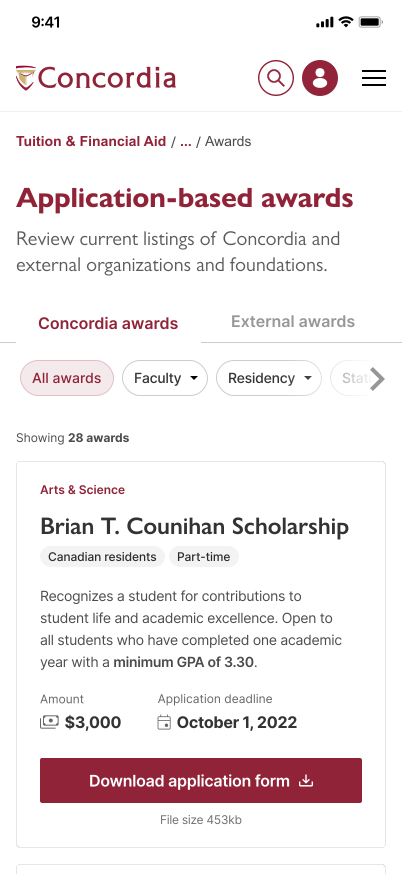
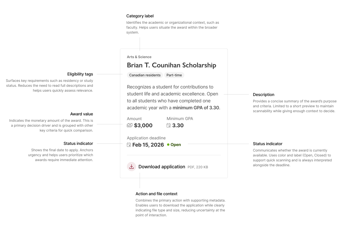
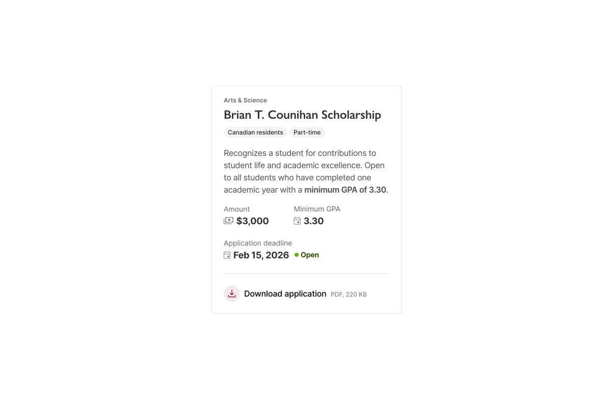
Finding funding was one of the highest-stakes tasks in usability testing, yet award content was often presented as long, undifferentiated lists with overlapping eligibility rules.
We introduced faceted search so students could narrow scholarships, bursaries, and awards by program, citizenship, application type, and financial need — with clearer labels for what each option required. The goal was fewer false paths: a shortlist students could understand without opening every description or reconciling tabs by hand.
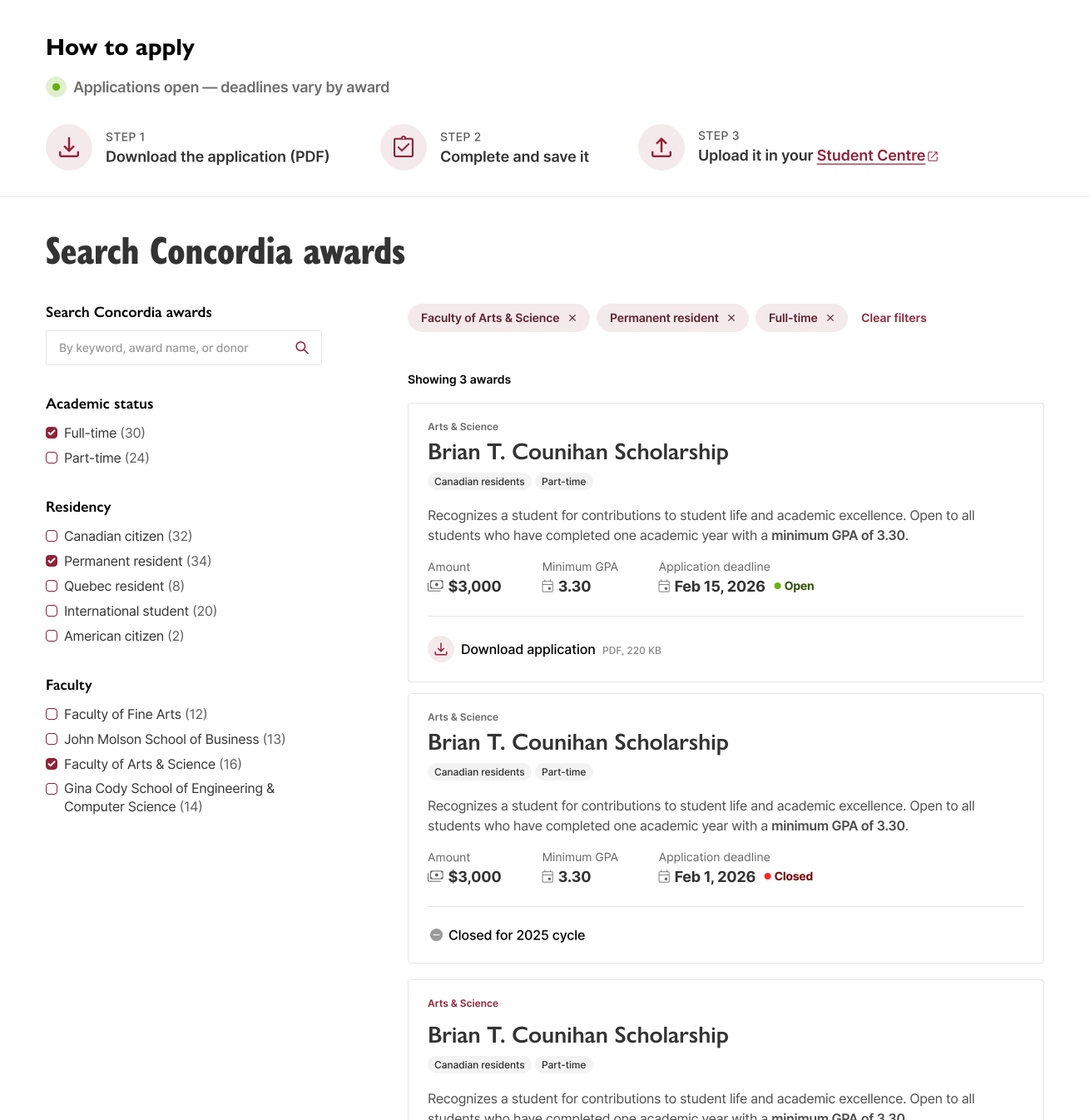
Desktop
Helping students understand cost before they plan around it.
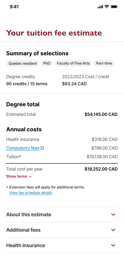
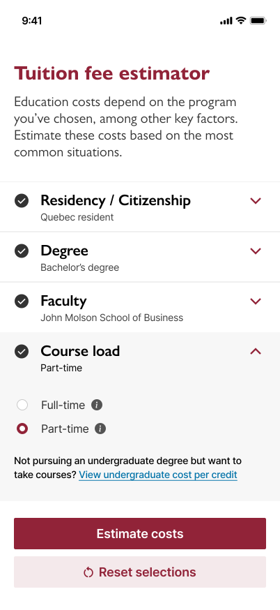
Tuition rarely arrives as one clear number — credits, residency, fees, and program details all shape the total, and students were often left to estimate cost on their own.
We introduced a tuition estimator that walks students through the inputs that matter to their situation and returns a personalized estimate they can sanity-check against aid and budgeting decisions. Surfaced within the unified hub, it sits on the same path from understanding cost to exploring funding, so students aren't jumping subsites to do the math.
Read full case studyEstimator screen
Estimate screen
Qualitative signals once the hub went live
I did not have instrumented analytics on the public site, so post-release evidence stayed qualitative. Financial Services began linking to the hub — not parallel subsite URLs — in student emails and orientation materials, and front-line staff described sending one destination instead of several to answer combined cost-and-aid questions. Those adoption patterns suggested the institution was treating the hub as the source of truth we had designed for. The quantitative lift documented in this case study remains from pre-release moderated testing.
2023
2025
2024
Want to see more? Check out my other work or get in touch.